Everyday Rewards — Travel Rewards
Context
Everyday Rewards is Woolworths New Zealand’s multi-partner loyalty program. Launching in 2024, members had to collect 2,000 Everyday Rewards points from participating partners to collect a $20 voucher. These vouchers could be redeemed for savings at our supermarket partner, Woolworths and fuel partner, bp.
Business need
Travel and flight rewards are one of the main reasons people join loyalty programmes. Now the business was bringing aboard not one, but two airline partners: Air New Zealand and Qantas. Both are well-established, recognisable global brands, and bringing both of them onboard would not only boost the value of Everyday Rewards for its members, but also lend more credibility to a still-new loyalty programme.
Air New Zealand is New Zealand’s national carrier, and already dominated a huge market share in the country. Qantas on the other hand was looking to break into the NZ market and position itself as a strong competitor.
User problem
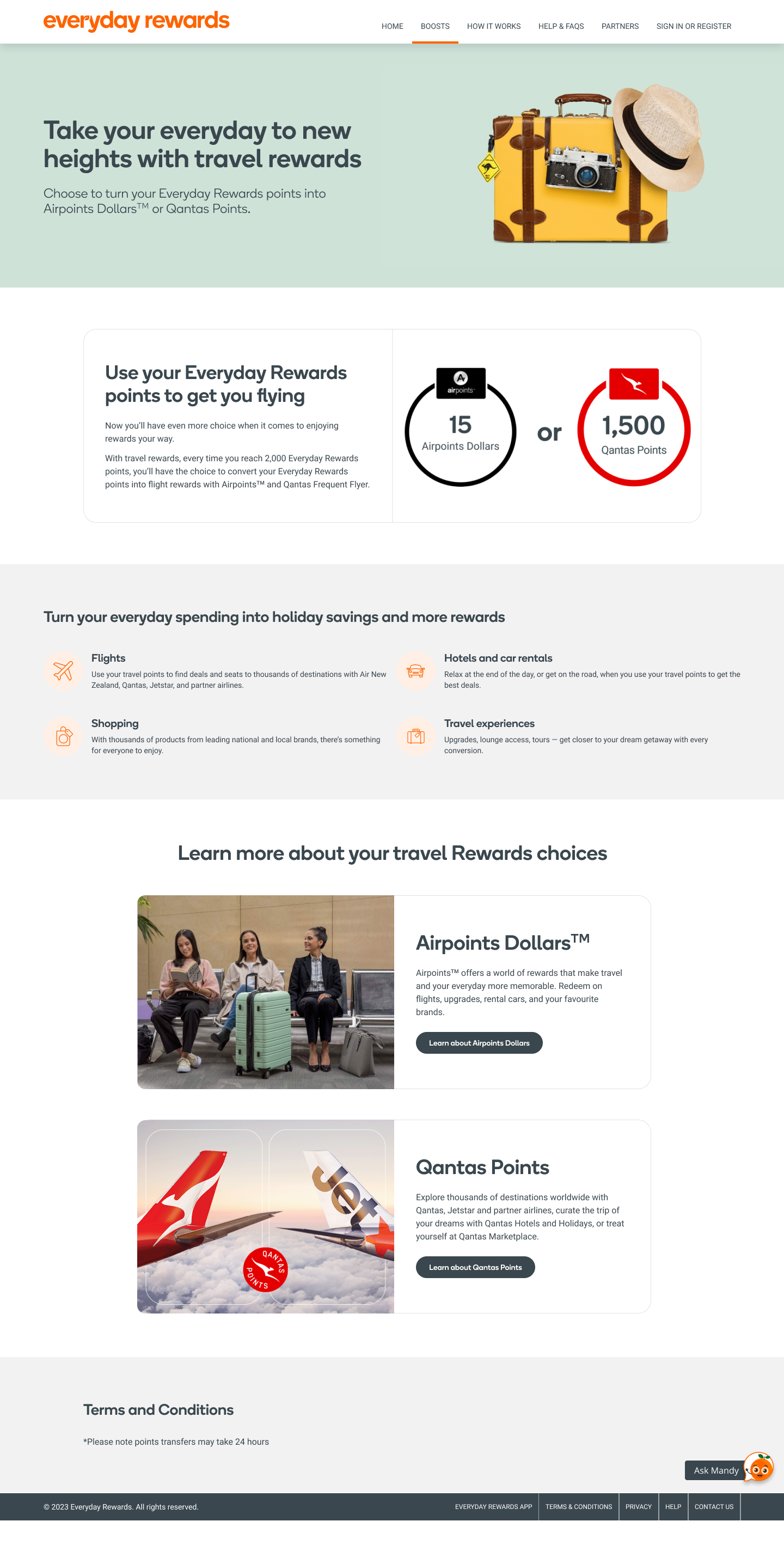
When Everyday Rewards first launched, members needed to collect 2,000 points to collect a $20 voucher. With travel rewards however, 2,000 points would be converted into either Qantas Points or Airpoints Dollars. We needed to not only launch travel rewards as a brand new proposition of the programme to raise awareness, but also educate members about how to select travel rewards, and how redemption worked differently from other partners.
Key considerations
Partner parity: We had to represent both partners equally while creating one cohesive redemption experience.
Journey touchpoints: I worked with colleagues in Lifecycle, Marketing, and Operations to understand what the full member experience could look like from end-to-end to ensure our members were aware and educate at very stage of their journey.
Phased announcements: The announcement of the partners and the redemption feature going live happened at different times. I had to write content that reflected accurate information at each phase, and ensure all touchpoints were updated as we moved across phases.
Defining content principles
Inspirational language was key. While we’re in the middle of a cost-of-living crisis, user research showed that flight redemption and rewards was still an appealing proposition. The idea that you can get closer to your next flight without doing anything more or differently than your usual shopping was a key proposition to communicate.
Correct terminology mattered. We already had one mechanism for rewards redemption. We had to communicate a whole new mechanism without making the experience confusing. So I chose language and terms that carefully explained these, for example:
- “Converting points” because we wanted to be clear to customers that their Everyday Rewards points aren’t actually used for redemption.
- “Automatically transfer” to indicate to members that once they chose the flight partner, we would automatically convert and transfer the points to their balance with no additional work on them.Dynamic content was necessary to personalise the experience. One of the key requirements was personalising the partner pages from Air New Zealand and Qantas, so members could see the content on the page change depending on whether or not they had opted into flight rewards.
Maintain our tone and voice. While Air New Zealand and Qantas have very strong brand recognition, it was imperative that both brands also fit into the overall experience of Everyday Rewards.
What I did
Build the redemption flow: I worked with UX to identify the overlapping requirements for both airlines, such as membership numbers and other identifying information, to create a flow that worked for both partners.
Designed the content and wrote copy: Based on our defining content principles, I wrote multiple versions of our flows and pages to satisfy the dynamic requirements requested by the partners, while maintaining tone and voice.
Audit the website and app: I did a content audit to identify all the touchpoints where we need to speak to travel rewards or direct members to update their rewards redemption to travel rewards.
Map the journey from email to web/app: With the phased approach, I designed a flow that took members from the email announcement to the website. This had to be done twice: once when we announced our new partners, and the next when we officially went live with travel rewards.
Managed internal stakeholder sessions: Before our weekly meetings with the external partners, our internal stakeholders met to align on key decisions and ensure we were all on the same page. I ran these sessions to share the latest UX and content feedback, request updates from stakeholders, raise blockers, and keep deliverables on track.
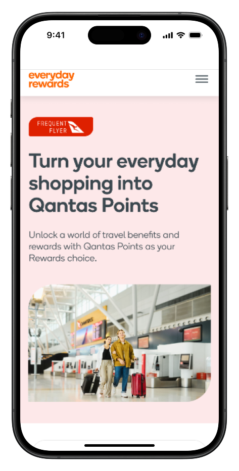
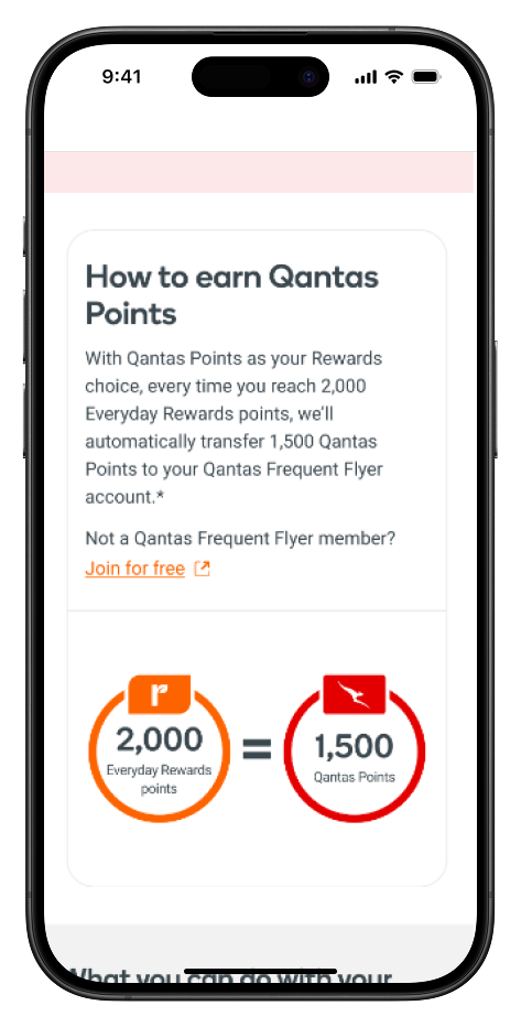
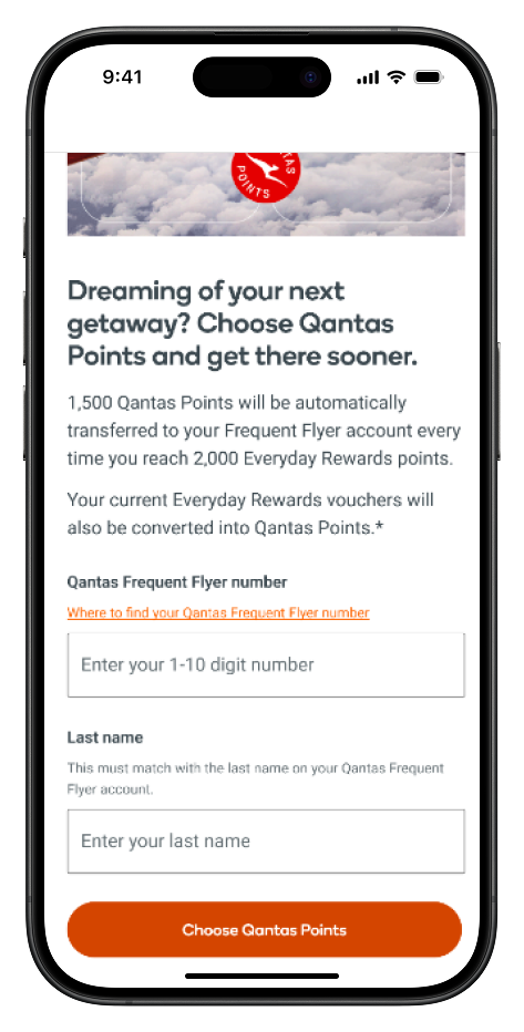
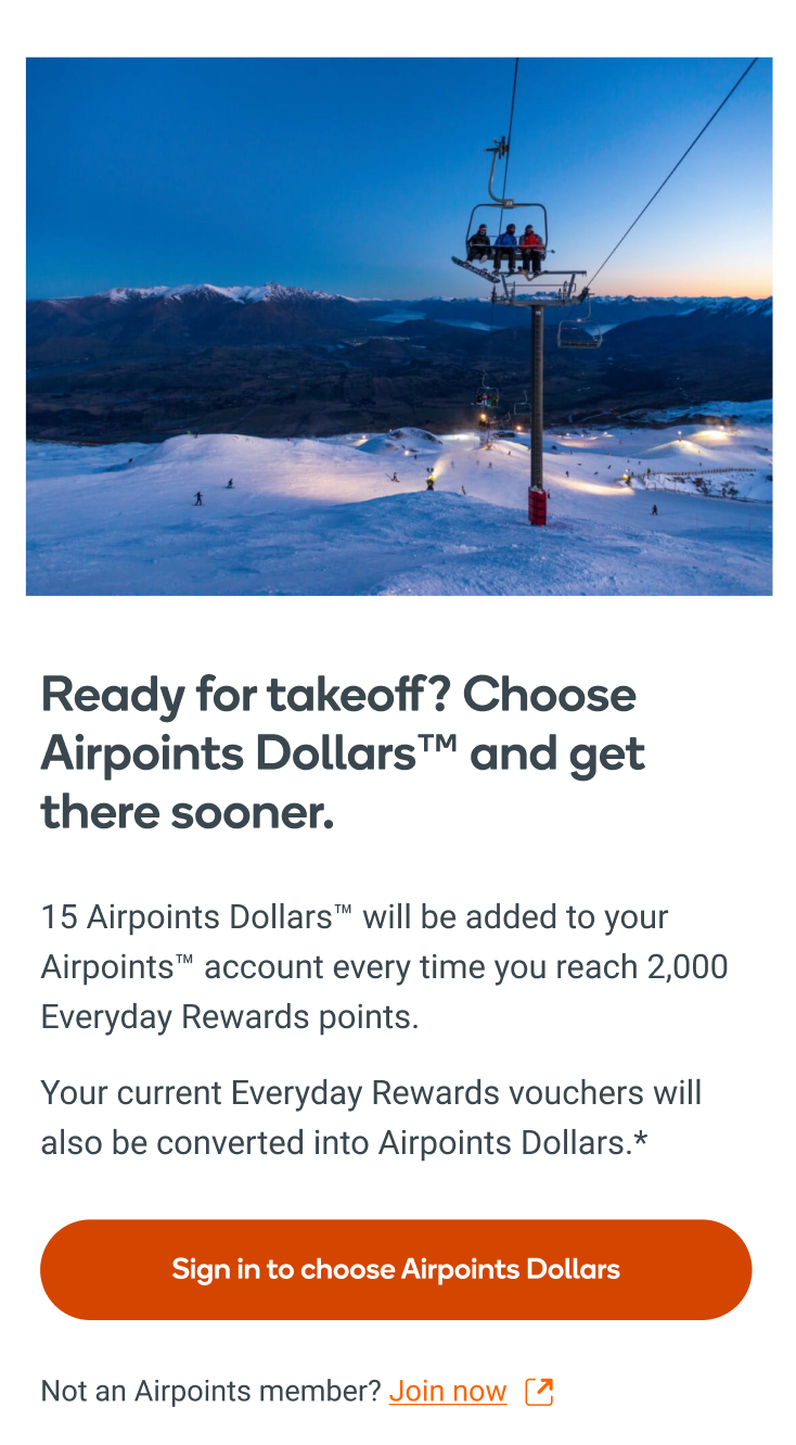
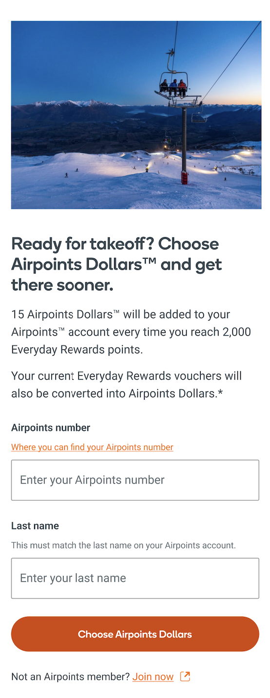
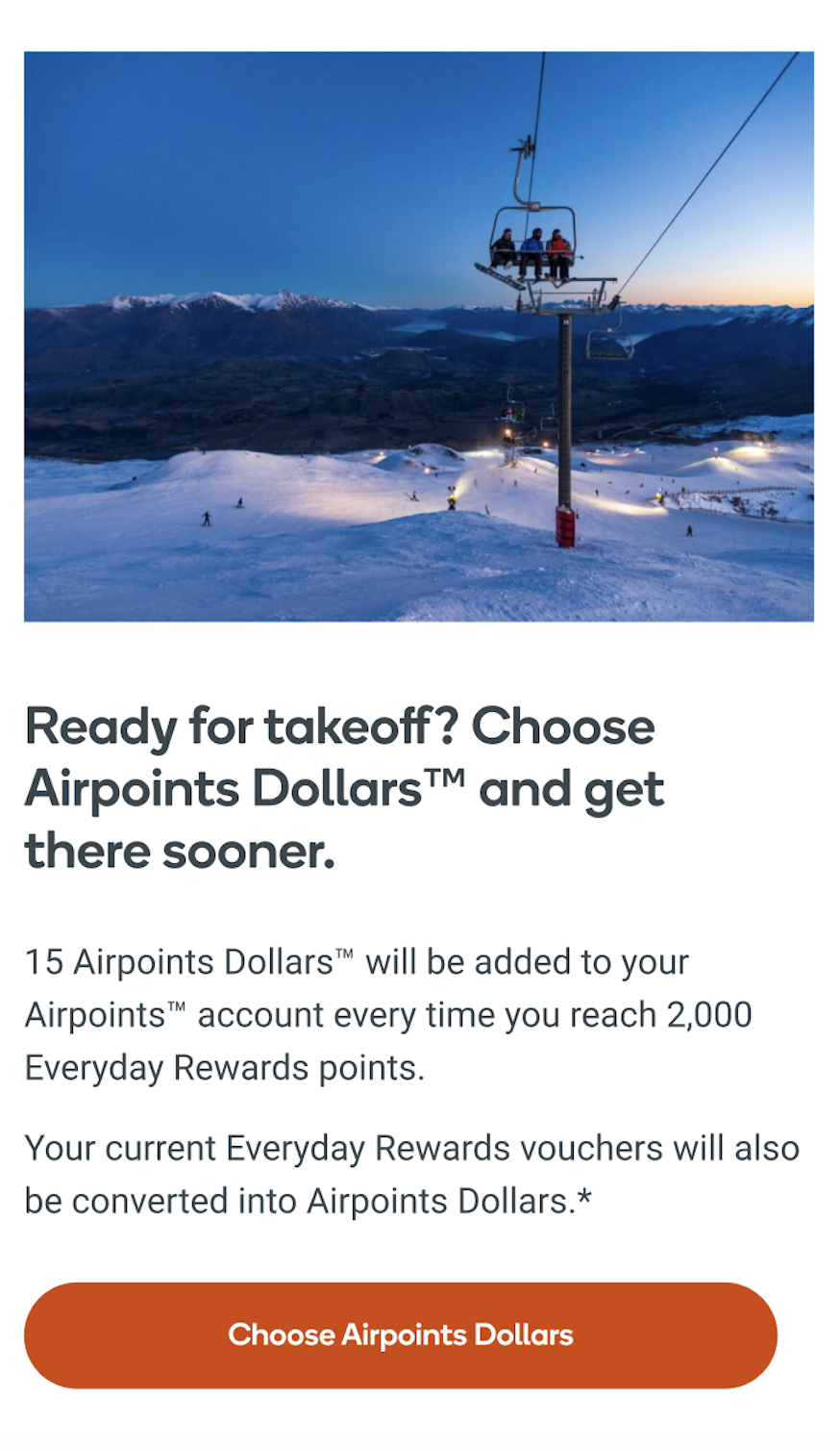
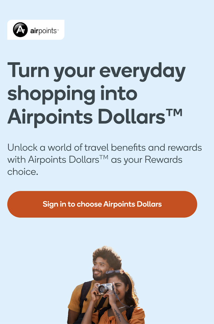
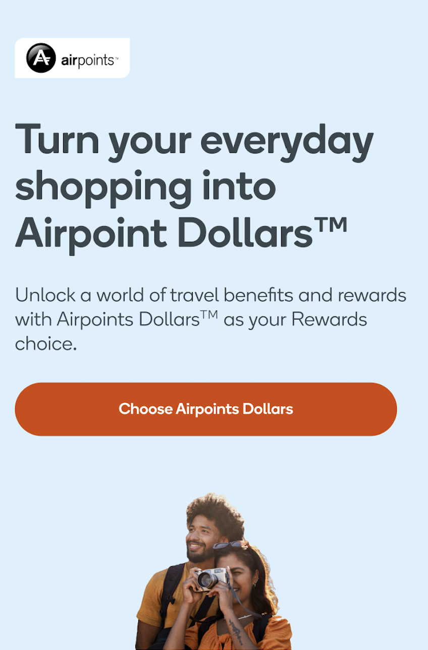
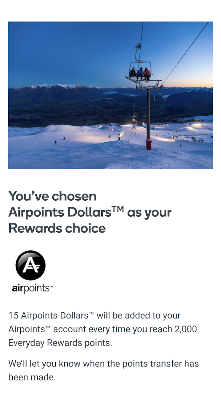
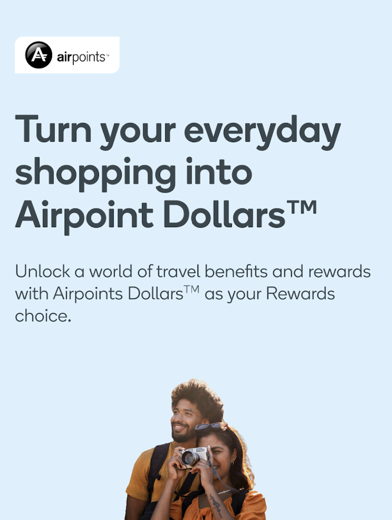
Each partner page had a dynamic header (H1) and a dynamic section to link their travel rewards membership. I had to create content for each of the 4 states to define the key action and next steps for members.
The 4 states are:
1. Signed out - content had to be generic
2. Signed in, not linked - member has signed into their Everyday Rewards account, but had not linked their account to their travel rewards membership(s)
3. Signed in, linked, not opted - member has linked their account with their travel reward memberships, but have not chosen travel rewards as their Rewards choice
4. Signed in, linked, opted in - member has linked their membership(s) and chosen a travel partner as their Rewards choice
The 4 dynamic states
Dynamic linking module
Dynamic header module
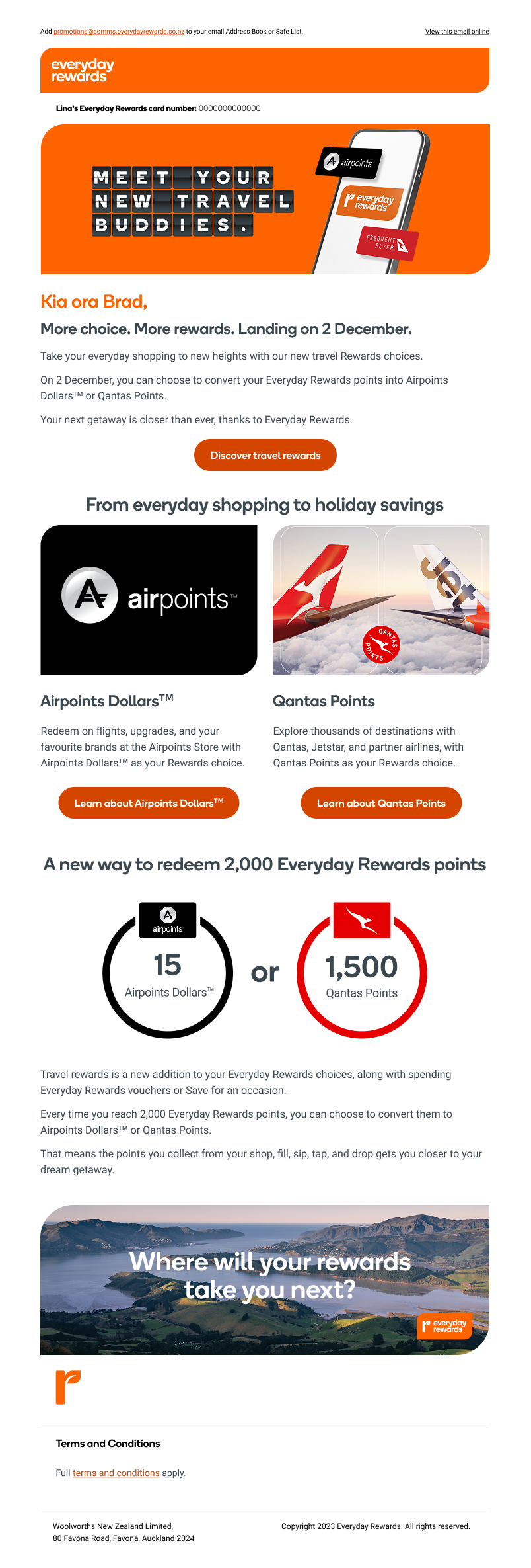
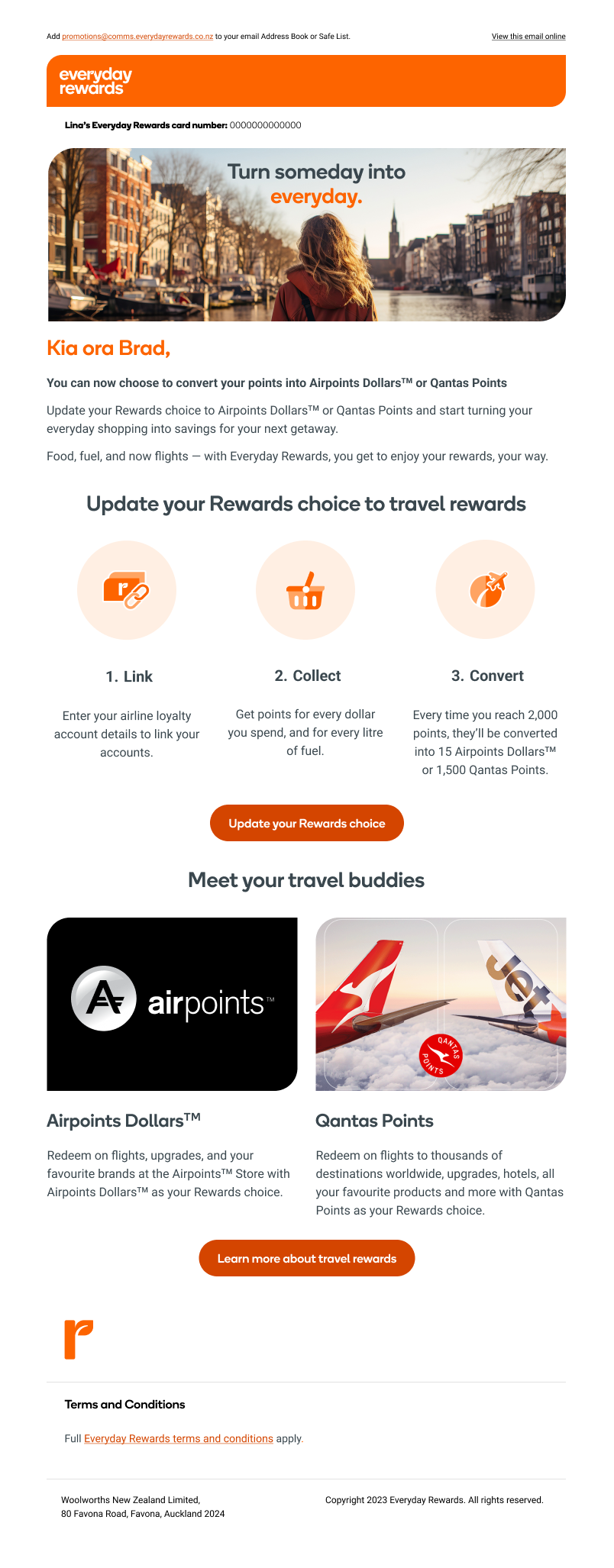
Announcing our new travel rewards choices
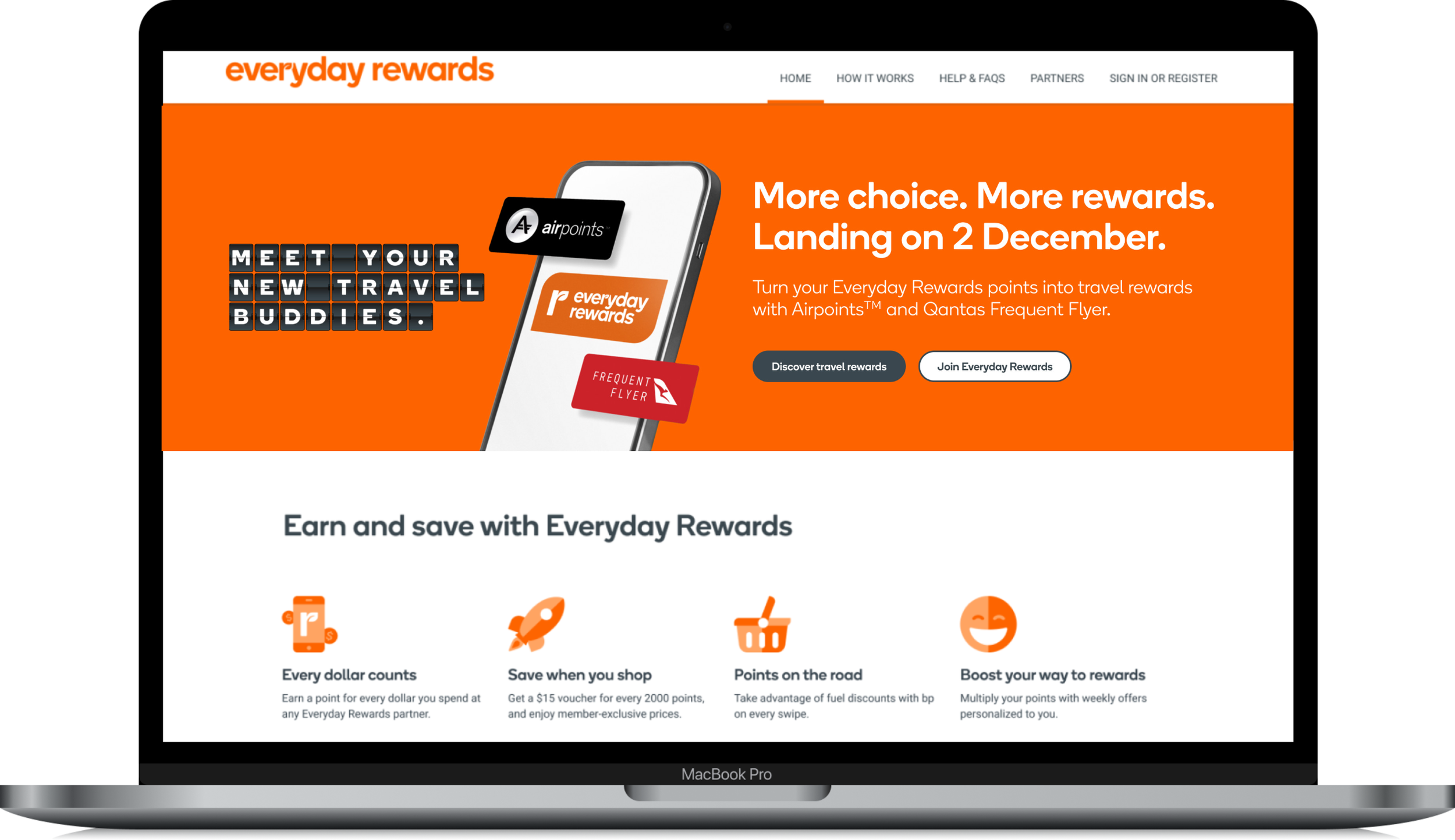
The phased email approach - partner announcement and official go-live
